• Welcome to BradleyFans.com! Visitors are welcome, but we encourage you to sign up and register as a member. It's free and takes only a few seconds. Just click on the link to Register at the top right of the page, and follow instructions. If you have any problems or questions, click on the link at the bottom right of the page to Contact Us.

Sports' All Time Ugliest Uniforms

Teams are being forced to wear uniforms not of their choosing now days. It's about time MLB quit having throw back days. The uniforms the Sox wore last Saturday were the worst of any I've seen.
 
I agree, some of the specialty/throwback uniforms, done just as a gimmick and a promotion are really ugly..
and more and more of the European soccer jerseys are nothing but a Nascar-like collage of advertisements, designed for the sole purpose of calling attention to the ads...
It's just a matter of time 'til jerseys in the US sink to this level...

pic.php


the other one I think belonged on that list above is this one...
2483481.jpeg
213106.jpeg
 
I actually like the old Buccaneer's uniforms.

And I thought the Padres brown/gold combination was pretty unique. Better than their current bland design.
 
I agree, some of the specialty/throwback uniforms, done just as a gimmick and a promotion are really ugly..
and more and more of the European soccer jerseys are nothing but a Nascar-like collage of advertisements, designed for the sole purpose of calling attention to the ads...
It's just a matter of time 'til jerseys in the US sink to this level...

pic.php


That's not a European soccer uniform...
 
ok...subst. "international" as they are all doing the same with the commercial logos all over the jerseys..


a lot of people also think these are horribly ugly uniforms...

MBBallTeam050602-lg.jpg
 
ok...subst. "international" as they are all doing the same with the commercial logos all over the jerseys..

No they're not. One logo sponsor on the shirt, is not "commercial logos all over the jersey"

image-5-for-manchester-united-v-liverpool-gallery-969550599.jpg


By the way, I vote for Bradley Soccer to get the all gray with red trim uniforms. Absolutely sick uniforms.


a lot of people also think these are horribly ugly uniforms...

MBBallTeam050602-lg.jpg


Those are warm ups, Indiana's unforms are some of the classic uniforms in all of college basketball...
 
so let me get this straight...
you show a guy with a huge beer logo on the front of his soccer jersey as
proof that European soccer jerseys don't have commercial ads on them??

:roll::roll::roll::roll::roll:

1259264506_31512a3ad5_o.jpg
 
so let me get this straight...
you show a guy with a huge beer logo on the front of his soccer jersey as
proof that European soccer jerseys don't have commercial ads on them??

I never said European soccer jersey don't have ads on them. Please go re-read my statement. I'm saying they do not have them "all over them", as you stated in an above post. And I wouldn't quite call it "huge". Sizeable and the largest thing on the jersery, yes; but unsightly, no. Afterall, that's what the person who signs the checks for the 8+ figure shirt deals want, exposure.

You will find that teams generally have one jersey sponsor, which brings in millions of dollars to the club. What it does not do however, is make it an ugly uniform. Manchester United's red/white/black kit scheme is timeless, much like Indiana's basketball uniforms, and the Yankees' pinstripes. And Liverpool's grey/red alternate kit is clean, and very well done. You can't tell me the Fighting DeRoses's wouldn't look sweet in that get up. Who's with me :)

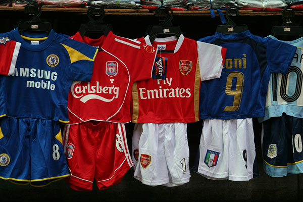
Jersey sponsorship is second nature in many sports and leagues around the world. That being said, there is a right way to do jersey sponsorship, which can be both profitable to the club and asthetically pleasing (see, DC United, Manchester United, Barcelona, Chelsea, etc.) Uniform sponsorship may seem foreign to many in the US, and often what's unknown or different is deemed "wrong", but ask any fan in the world what's uglier, wearing a Samsung Mobile logo across your chest, or paying over $2,000 per seat to watch one regular season baseball game...

With that, I respectfully step off my soap box.
 
so let me get this straight...
you show a guy with a huge beer logo on the front of his soccer jersey as
proof that European soccer jerseys don't have commercial ads on them??

:roll::roll::roll::roll::roll:

1259264506_31512a3ad5_o.jpg

Also, the reason these look so big in this picture is that they are uniforms made to fit a young child...
 
Those are warm ups, Indiana's unforms are some of the classic uniforms in all of college basketball...

Being a Liverpool fan and seeing all of the fan reactions (I'm a member of quite a few liverpool forums), they really dislike the gray aways. In fact, they were scrapped after a year and now are a new Black and Gold jersey, and they look pretty phenomenal in my opinion.

Jerseys are behind this link....
http://store.liverpoolfc.tv/product...c-adult-away-long-sleeve-shirt-0910/pid-28329

I really like those new Liverpool aways. I'm still a fan of the grey and reds, personally :)
 
Just to add to this conversation...I agree though, most European Futbol teams are really good about their sponsorship logos. They are very good with them in Europe and in fact you really begin to forget about them because they are so seamlessly involved into a teams jersey. There are some teams throughout the world through different sports where the jerseys do begin to look like huge marketing adds. Although I hope that for the sake of class and appearance other teams do not take up this philosophy.

However, there are some teams that use their sponsor logo in a horribly ugly way. The one that always comes up as an eyesore for me is the Chicago Fire Best Buy logos. They look steamed on and incredibly out of place. See http://www.worldsoccershop.com/shop-by-team-chicago-fire.html

On the other hand, the Houston Dynamo do a beautiful job of incorporating their logo IMO: http://www.worldsoccershop.com/shop-by-league-mls-houston-dynamo.html

On the topic of how much these sponsorships benefit a deal. For Manchester United (who recently signed a new shirt deal with Aon), last year received 14 million pounds (About 20 Million US) to simply put their name on their shirts. Thats alot of cash to have their company's logo put on a jersey. Just think, that would pay Arod's ridiculous salary for a year.
 
The US major sports team and for that sake the college teams already use corporate sponsors for their sporting attire. Ohio Stat has a huge contract with Nike. Every major basketball player has a shoe contract with one of the big shoe companies. I'm not against logo ware on the Jersey's if it helps off-set the costs for fans to go to the game. Unfortunately all that money will probably just go to the owners and players.
 
Aren't we forgetting the most obvious ugly uniform?

Aren't we forgetting the most obvious ugly uniform?

For me its easy, ugliest uniforms ever.....
 

Attachments

Back
Top