• Welcome to BradleyFans.com! Visitors are welcome, but we encourage you to sign up and register as a member. It's free and takes only a few seconds. Just click on the link to Register at the top right of the page, and follow instructions. If you have any problems or questions, click on the link at the bottom right of the page to Contact Us.

History of the Bradley alternate color uniforms

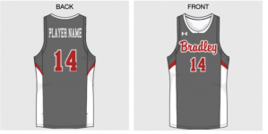
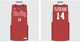
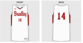
Has there been any real discussion in the Athletic Department about doing an alternate jerseys? I wouldn't mind a jersey re-design for next season as a whole.

I agree. I have not heard anything about it if there has been.
The comments I have heard about the current uniforms are that they are nice, but rather dull and generic-looking
 
While we are at jersey redesigns and alternate color jerseys (both severely needed), can we go back to the old BU Braves logo too? I still feel like the new logo is bland itself, just like the jerseys since the redesign. I know we won’t change back cause it cost money to get this new logo, but man do I miss the old logo. Are we stuck with it forever?
 
This website attached allows you to design Under Armour jerseys for different sports. I have attached some quick ones I made based on some of their templates, including Wisconsin. Didn't take long, but I think all of these look less generic than ours right now. A lot of people seem to like the cursive so I used that, but you can use the old block style we had as well. I like the gray with red cursive letters, or the red with white letters and gray outlines.

image_539.png
Bradley 1.png - Click image for larger version  Name:	Bradley 7.png Views:	0 Size:	38.5 KB ID:	501278
 

Attachments

  • Bradley 1.png
    Bradley 1.png
    76.8 KB · Views: 0
  • Bradley 2.png
    Bradley 2.png
    35.8 KB · Views: 0
  • Bradley 6.png
    Bradley 6.png
    45.9 KB · Views: 0
While we are at jersey redesigns and alternate color jerseys (both severely needed), can we go back to the old BU Braves logo too? I still feel like the new logo is bland itself, just like the jerseys since the redesign. I know we won’t change back cause it cost money to get this new logo, but man do I miss the old logo. Are we stuck with it forever?

Oh jeez please no!!! That logo was terrible!!! Looked like something someone put together in a basic microsoft paint program.
 
Here is something I heard from a reliable source regarding the current logo. After the Bradley President in 2012 authorized and reportedly paid six figures to the Joe Bosack Graphic Design Company to come up with the new logo, I heard she then hired a firm to remove all images of the previous Bradley logos and mascots from the internet. I didn't think that was possible at the time, but since then I have tried to search for images of the older Bradley logos and mascots, and it is virtually impossible. Try finding images of those previous logos and mascots today, especially any of the earlier ones with Indian heads, the Chief with the headdress, the "B" with feathers, and other more offensive Native American imagery.
Now, about the only place you'll find some of those old logos and mascot images is here on Bradleyfans-
https://www.bradleyfans.com/forum/sp...590#post431590
https://www.bradleyfans.com/forum/sp...601#post431601

I have yearbooks and media guides going all the way back into the 1940's, so I have all those old logos. But they are near-impossible to find now on the internet.

Here is a New York Times page from 2009 with a couple old Bradley logos that somehow escaped the purge-
http://archive.nytimes.com/www.nytim...ICKNAME_5.html

But I can't find any of the ones with the feathers on the Capital B, or the profile of the Indian Chief with the full headdress.
 
Oh jeez please no!!! That logo was terrible!!! Looked like something someone put together in a basic microsoft paint program.

Which one do you mean? You don't like the old BU Braves one or the new one? I think the current one is pretty bland and unrecognizable. People knew whenever they saw the previous one who it was for. Now I'm guessing the average person has no idea what school the current logo represents, could be anyone with a B.
 
Which one do you mean? You don't like the old BU Braves one or the new one? I think the current one is pretty bland and unrecognizable. People knew whenever they saw the previous one who it was for. Now I'm guessing the average person has no idea what school the current logo represents, could be anyone with a B.

While I agree the new logo is kinda bland, I do like it more than the previous BU block logo, with the script Braves. The block BU logo looked like it was out of clipart.
 
Hmm interesting, I still like the old one better. Like I said, seems more recognizable to me than the new one. Maybe part of it is nostalgia too. I'm not sure what the general consensus is on which of the last two logos is best. I remember when it came out people didn't seem overly impressed with the new one. In looking through most D1 college logos, I don't see the older logo as cheap looking. I could be in the minority there I suppose.
 
Seems like people on twitter are excited for them. I'm indifferent on these. It doesn't look exactly like the 2006 unis. I also am not a fan of the old logo. But if people like it, I'm happy they're happy
 
Love these! They even have the old, pre-2012 Bradley logo, which a certain past administrator did not want anyone at Bradley to allow to be used again.
BU-logo.png


I have been wanting to see an alternate color uniform, but this is the next best thing.
Thanks Bradley!

Here is the pregame article from BradleyBraves.com-
https://bradleybraves.com/news/2022/...-saturday.aspx

mail
 
Back
Top