Originally posted by Tommy
View Post
Announcement
Collapse
No announcement yet.
Unconfigured Ad Widget 7
Collapse
Indiana State unveils a new logo
Collapse
X
-
I’ll pass it by Chris Reynolds in St. Louis. I can only assume he’ll be excited.Originally posted by Dub View Post
Needs work, but if our team was say 32-3 or so, I agree we could go with something like this no problem.Larry Bird
I've got a theory that if you give 100 percent all of the time, somehow things will work out in the end.
Comment
-
Funny to look back at the comments in this thread...
I think we are overdue for a new Bradley logo.
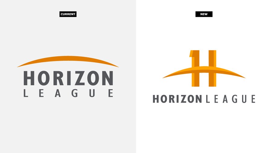
But here is another story about rebranding- The Horizon League just changed their logo. I'm not sure why. The old logo looks fine to me, and the new logo looks quite strange with the strange combination of the arc and the H, and the number 1 in it for no good reason.
Comment
-
I like it and most people I've talked to like it.Originally posted by tomahawk chop View PostThe Bradley logo is boring. Everything she did had east coast boring all over it plus she wasted so much money on many things. She should have never been here to begin with and we are still paying for her mistakes.The True Gentleman is the man whose conduct proceeds from good will and an acute sense of propriety, and whose self-control is equal to all emergencies... - John Walter Wayland
Comment
-
When I have worn my Bradley hat with the B logo out of town, people ask "Did you go to Boston College". I then state that I went to Bradley and if they ask where it is located, I state its between Chicago and St Louis. Surprisingly, a lot of people I meet know Bradley. Years ago, I met someone in Paris who went to Bradley and knew Frank Sylvester.
Comment
-
there is a good reason, it's to highlight that they are a conference of ELEVEN teamsOriginally posted by Da Coach View Post...the new logo looks quite strange with the strange combination of the arc and the H, and the number 1 in it for no good reason.
Comment
-
But it is not an 11, it is a 1I.Originally posted by yoda View Postthere is a good reason, it's to highlight that they are a conference of ELEVEN teams
And the Horizon League press release explains the new logo without referring to the 11 teams. Instead, it explains the "1" in the H this way-
One key element of the recharge is a new “H” icon with gold tones of the horizon in the arc along with a “one” to symbolize the unity of the League and our members.
The Horizon League press release also describes the rebranding with a bunch of nonsensical explanations like "bolster pride", "amplify the inspiring stories", "providing a message of unity and shared focus", "emphasizes all aspects of the holistic person", and many more idioms. Who wrote this stuff, some new-age psychic?
https://horizonleague.org/news/2023/8/11/general-horizon-league-announces-brand-recharge.aspx
Here is the press release. Try to read without laughing. I didn't know that a logo could do all these things!
“The League presidents and chancellors launched this brand recharge to bolster pride across our League members and amplify the inspiring stories of our student-athletes,” stated Horizon League Commissioner Julie Roe Lach. “This recharge modernizes our League brand while providing a message of unity and shared focus amid a dynamic collegiate athletics environment.”
The updated messaging emphasizes all aspects of the holistic person as well as the impact that the current experiences of student-athletes, distinctive within the League, have on the rest of their lives. In the coming months, the HL will be starting new messaging campaigns to better highlight and focus on the student-athlete experience within the Horizon League.
The recharged communication strategy emphasizes four key pillars of the Horizon League Experience: Major Cities, Major Experiences, Major Moves and Major Impact.- Major Cities highlights exposure to entities and experiences unique to major metro cities (professional sports, media, culture, arts, business) in the League’s footprint.
- Major Experiences focuses on NCAA Division I competition and championships and ESPN exposure across the League.
- Major Moves highlights the League’s commitment to innovation and forward-thinking approach to challenges while addressing emerging trends in all aspects of the college sports environment.
- Major Impact emphasizes how our League through our members and student-athletes lead in our metropolitan campus communities and championship host cities.
The imagery is built around the symbolism of the horizon, including the junction of earth and sky, the seamlessness of the student and athlete, the end of today and start of tomorrow and the possibilities beyond what we see.
The League and its members will also utilize #OurHorizon on social media along with the sunset emoji to represent the themes of the recharge and emphasize the unity between our League and our member institutions.
Additional visual influences include the “golden hour”, a photography term referring to the period of time just after sunrise or just before sunset when the light is infused with gold tones, and blue colors taken from the sky at dawn and dusk.
The League partnered with The Rinebold Company and Section 127 on the initiative.
“The research we conducted with Horizon League presidents, administrators, coaches and student athletes indicated a great deal of pride in the student-athlete experiences at their 11 member schools. But what was missing was a collective and more personal voice that goes beyond the structural and administrative nature of the League,” said JoJo Rinebold, Principal of The Rinebold Company who led the brand strategy. “The opportunity for the Horizon League brand is to elevate the unique aspects of how their member schools impact 3,000+ student athletes far beyond their time in college.”
New visual elements were created to emphasize the updated messaging points and highlight the symbolism of the horizon.
“The Horizon League visual identity consists of several elements related to the horizon, ‘the meeting point of the earth and sky, the student and athlete,’” said Arnel Reynon, Executive Creative Director at Section 127. “The horizon line itself represents a unifying visual as Horizon League members share the same horizon even though they are in different cities across the Midwest. The color palette draws inspiration from the light of the golden hour, or the time of day surrounding dusk and dawn, while the gritty textures in the graphic elements portray city skylines that each member school enjoys. The uniquely designed elements belong to a larger unifying entity, much like the athlete is to a team and a team is to a league.”
Comment
-
I would agree. I also think it is not identifiable like the old BU logo. Everyone knew that was Bradley, whereas no one knows what the current logo is when I wear it without asking. I think only a B without a U is the problem (on top of the boring look to me). I wonder if anyone has any ideas for a new logo? I wonder if a cursive BU could be made?Originally posted by tomahawk chop View Post
It is boring and a copy from out east. Shows zero imagination. They need someone in the marketing dept. to come up with a better one. Most of the fans I know hate it.
The baseball team has had some decent looking B's to me on their hats in the past (and also incorporate the official gray color in the uniform better than basketball ever does). A cursive B baseball hat and a thicker B with sword like structure in the middle (Tauchman) are pictured in the attachments. They also have had cursive jersey font which looks nice. I wonder what the Tauchman hat B below would look like with a U in similar style next to it.
Comment
-
I like it but would like to see something that differentiates from a School such as Boston, which was mentioned before. I'm not sure a plain BU would change that either. We need a contest to design a logo that would make BU stand out.
I do like the B at the Civic Center. I wouldn't want it any smaller. Can we have the floor painted Red so the White B stands out more?
Comment
Unconfigured Ad Widget 6
Collapse


Comment