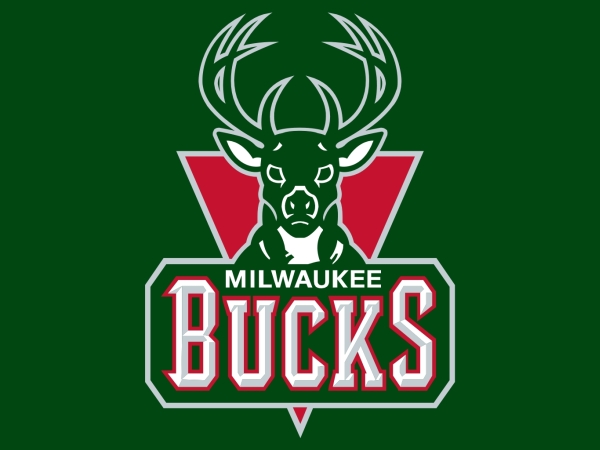
The Milwaukee Bucks are going to unveil a new logo....
the reason this is in the news is twofold - that they have spent a bundle via top shelf design agencies...
and yet some think this new logo looks like a demon-possessed deer
I think it's the same effect the ISU Redbirds did a few years ago to change their logo to make the bird look angrier
Real old logo:

Recent logo:

Newest logo:

the reason this is in the news is twofold - that they have spent a bundle via top shelf design agencies...
and yet some think this new logo looks like a demon-possessed deer
I think it's the same effect the ISU Redbirds did a few years ago to change their logo to make the bird look angrier
Real old logo:

Recent logo:

Newest logo:

Comment