As we wait for Bradley to soon unveil the design of their new Gargoyle logo, here is another Division I school that just hired a consulting firm to help them update their logo (which has only been in use since 1999), and the new logo was just released.
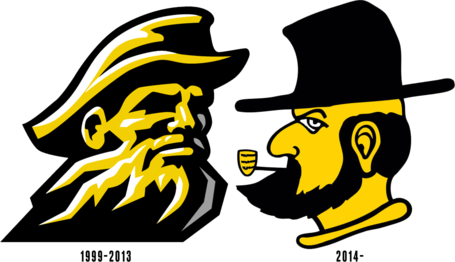
They previously had a logo of a rugged mountain man and changed to a new logo that is a cartoonish hillbilly character smoking a corn cob pipe.
Here are the old and new logos for the Appalachian State Mountaineers-

The reception I have read on their message boards so far is mixed. Some expected a new logo that would be more friendly for the Appalachian State women's teams to adopt, others were expecting a fiercer looking logo and don't like the cartoonish look. Some have referred to it as looking like a character out of The Simpsons.
They previously had a logo of a rugged mountain man and changed to a new logo that is a cartoonish hillbilly character smoking a corn cob pipe.
Here are the old and new logos for the Appalachian State Mountaineers-

The reception I have read on their message boards so far is mixed. Some expected a new logo that would be more friendly for the Appalachian State women's teams to adopt, others were expecting a fiercer looking logo and don't like the cartoonish look. Some have referred to it as looking like a character out of The Simpsons.
Comment