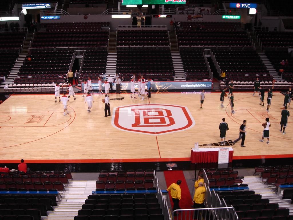
Thoughts? Feelings? We have not lost on the new floor yet!
Announcement
Collapse
No announcement yet.
Unconfigured Ad Widget 7
Collapse
New floor
Collapse
X
-
Maybe its just me...but I really like seeing the Bradley name during the Illinois high school state tourney on the TV...good promo IMO...I think we lost that on this new floor...would rather have seen the Bradley University letters on the sidelines in the black instead of under the baskets!Originally posted by Bradleyfan1 View PostThe logo stands out! But u r right I think they went for a unfinished look which i like.
Comment
-
I was unable to go to the game, so maybe the floor looks better in person. But from the picture, I think the new floor sucks.Bradley 72 - Illini 68 Final
???It??�s awful hard,??�??� said Illini freshman guard D.J. Richardson, the former Central High School guard who played prep school ball a few miles from here and fought back tears outside the locker room. ???It??�s a hometown thing. It??�s bragging rights.??�
Comment
-
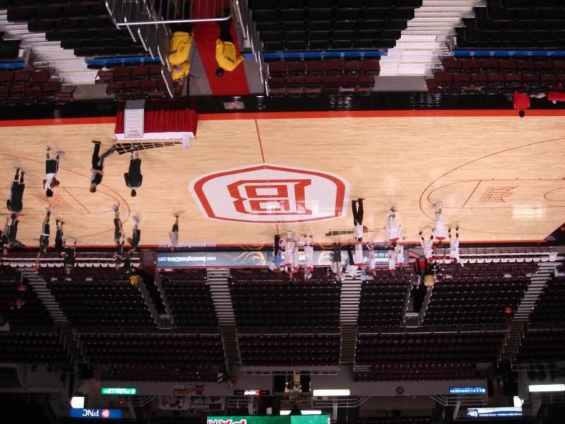
To the half of the people in attendance that sit on the other side of the floor, the logo looks backward like this (sorry I don't have a picture from the bench side, so I merely inverted the only photo I have of the floor). And I agree that the size of the logo is morbidly large.-

Comment
-
Our logo might be a bit obese, but it is nowhere near the morbid obesity of the ISU redbird logoOriginally posted by Da Coach View PostTo the half of the people in attendance that sit on the other side of the floor, the logo looks backward like this (sorry I don't have a picture from the bench side, so I merely inverted the only photo I have of the floor). And I agree that the size of the logo is morbidly large.-


Comment
-
They'd have to wait until there's a clear shot of the writing at the end of the court.Originally posted by California Alum View PostHow would someone on TV know it's Bradley University????People say, ???Forget last year', but I want our guys to remember that one, because that will not happen again. We will be much better.??? Geno Ford, 9/22/12
Comment
-
Is the primary school color still RED and why isn't there more of it on our home court? ???People say, ???Forget last year', but I want our guys to remember that one, because that will not happen again. We will be much better.??? Geno Ford, 9/22/12
Comment
-
Logo's too big, looks slick overall though I would also have liked the Bradley name in a more noticeable place. Seriously, the PCC has more TV marketing potential with their logo.
... At the end, of the storm, there's a golden sky. And the sweet silver song of the lark. Walk on, through the wind, walk on, through the rain, though your dreams be tossed, and blown. Walk on, Walk on with hope in your hearts, and you'll never walk alone!
I'm behind you 100% Bradley Braves, You'll Never Walk Alone! BEAT STATE!
Comment
-
I THINK THE NEW FLOOR IS AWESOME!!!!
I LIKE THE LOGO. I think that, especially, in the first few years of a logo switch having it be a centerpiece is exactly what is necessary.
I like that the out of bounds lines are stylized to match the B - did ya notice that, whiners?
You guys were posting pics of the most obnoxious floors possible and this new floor is nowhere near any of those. I mean seriously, you took a pic of it upside down...well...ONE FREAKIN' LETTER UPSIDE DOWN IS EASIER TO READ THAN SEVEN.
People watching on TV won't know who "B" is? Well, hopefully they'll watch for more than a channel flip during commercial breaks (and if they don't care to watch enough basketball to see a team inbounds the ball and read "BRADLEY" at the end zone...well...who cares).
If you want to gripe about anything - hows about pointing out that the old BU logo was spinning over the top of the new during the starting lineups. They obviously hadn't switched out the light that does that yet.
I suppose I should just be thankful no one called this part of the FALLOUT (yet) and that we aren't all b!tching about losing to another UofW-P school.
Comment
Unconfigured Ad Widget 6
Collapse

Comment