Announcement

Collapse
No announcement yet.

Unconfigured Ad Widget 7

Collapse

2011-2012 BU uniforms

Collapse
X
 
  • Filter
  • Time
  • Show
Clear All
new posts

  • 2011-2012 BU uniforms

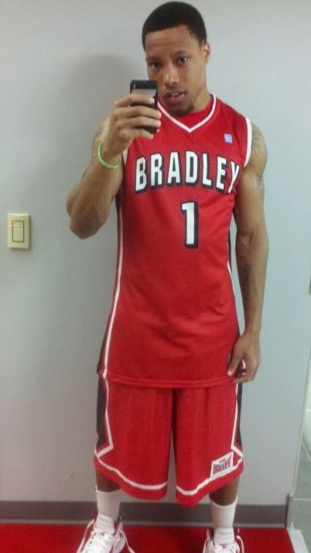
    Bradley's uniforms for this season- this is the only view we've seen, yet. They are a little different from last year's red unis- see below-


    Last year's road uniforms. The trim is different. We should get some pics of the fronts soon-

  • #2
    Glad to see the stupid white blocks are gone from the backs of the shoulders. Wish they would also ditch the black drop shadow on the numbers, but oh well.

    Comment


    • #3
      I like the white collar trim - I think we had those in the Rob Dye/Roberson era if I'm not mistaken. I like the look from the back - not too fond of the shadow around the #'s either. Looking f/w to seeing the whole uni.

      Comment


      • #4
        We have a look at the fronts of this year's new uniforms. I like them. Thye pants look a little baggier, but I guess that's the style. -

        Comment


        • #5
          The unis are actually pretty cool, literally. They are extremely light and the material almost feels like a paper. Although much looser fitting (thank goodness), they actually remind me of the material my competition swim suits were made of back in the day. They also have holes along the sides of the shorts and are close to mesh on the back, as you can probably see from Jalen's picture.
          Bradley Associate AD for Communications and Operations
          Twitter:
          @BPtheBrave

          Comment


          • #6
            How often does the team get new uniforms?

            Comment


            • #7
              Usually every other year, or maybe every third year. Has as much to do with Nike marketing efforts as anything.
              Bradley Associate AD for Communications and Operations
              Twitter:
              @BPtheBrave

              Comment


              • #8
                Good to hear they are "hi tech". Light does help speed.

                I still want to see the college of engineering test those in a wind tunnel

                Comment


                • #9
                  Originally posted by Da Coach View Post
                  We have a look at the fronts of this year's new uniforms. I like them. Thye pants look a little baggier, but I guess that's the style. -

                  I like the look personally - the shorts' design look cooler to me, the "BRADLEY" across the front of the jersey appears bigger, and just a better look IMO, especially with the white trim.

                  The block style numbers I wish they'd change, but that's my only gripe.

                  Comment


                  • #10
                    I wish they'd go back to the cursive lettering with the light blue trim. I didn't live through it but I love them! Favorite White Out shirt. I remember the run too, something special! HEY ATHLETICS DEPARTMENT! Maybe do that again this year instead of a "black out"?
                    ... At the end, of the storm, there's a golden sky. And the sweet silver song of the lark. Walk on, through the wind, walk on, through the rain, though your dreams be tossed, and blown. Walk on, Walk on with hope in your hearts, and you'll never walk alone!
                    I'm behind you 100% Bradley Braves, You'll Never Walk Alone! BEAT STATE!

                    Comment


                    • #11
                      Anyone know if we will have the black alternates again this year? I liked them the last couple years.

                      Comment


                      • #12
                        At what point will the shorts become pants? I'm not saying I want something like John Stockton used to wear, but somewhere in the middle seems logical.

                        Comment


                        • #13
                          I think we need an alternate that says "Braves" on the front...

                          With the lettering had what looked like a stitched border rather than blocked

                          Comment


                          • #14
                            I sure hope the shorts look better in person than they do in this picture. They just seem real "sloppy" to me (for lack of a better word).

                            Comment


                            • #15
                              Originally posted by Braves4Life View Post
                              I sure hope the shorts look better in person than they do in this picture. They just seem real "sloppy" to me (for lack of a better word).
                              I see what you're saying, but they look the same as last year (see the pic of Warren above).
                              ???People say, ???Forget last year', but I want our guys to remember that one, because that will not happen again. We will be much better.??? Geno Ford, 9/22/12

                              Comment

                              Unconfigured Ad Widget 6

                              Collapse
                              Working...
                              X